It’s almost a new year, which means that new design update and new design trends are going to hit us. But there are amazing web sites shooting up every week, with some hidden gems offering a real amount of inspiration and true creative flair. The thing is, unless you’re actively looking – a lot of these amazing sites can easily slip under the radar, never going viral or getting the attention they deserve.



Here are some of my favourite websites – where the design and content fall so nicely into place – and then, suddenly, my inspiration levels are suddenly off the chart. I thought I’d share them with you – because with the New Year right around the corner – we could all do with a spark of inspiration to keep us going!
Awesome example of responsive design, and keeping things
clean, fresh and simple. I don’t like over-complicating thing if they needn’t be
– so this site works for me on every level.

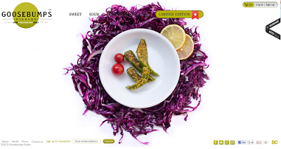
Again, another food site. I love how this site keeps things
easy going and uses photography as their main selling point. The product is the
food – so I love how they’ve kept all attention just that.

I love the cheekiness of this web design – on first glance
it looks well thought-out and confident but when you hover over the icons you
get a real sense of the personality behind the design. Each icon comes to life
as you hover over it, bring a bit of life into the mix and fun.
This is a relatively new venture from Google but the
emphasis is completely on user experience and that’s what I like about the
page. Whilst the design does lack a bit of fun – they’ve managed to inject the
right amount of savvyness and information – whilst staying true to their
simplicity and design roots.
It’s the nice use of colour that inspires me in this website
– and the restrained use too. They could’ve gone over board with the colour –
but instead it has personality without being brash over too bright. The
typography is pretty sweet too and works perfectly alongside.
This site has the most perfect (and I mean perfect) colour
palette of almost any website I’ve ever seen. I love how the colours complement
each other and how the text is perfectly placed and perfectly readable. Which
is important when you’re working with a cause as big as this.
This is a great example of how to successfully use scrolling
in website design – and I just adore everything about it. The photography is
beyond perfect – as is the choice of positioning and colour.
This website is all about the visual for me and I love how
the homepage uses the boxes to draw in intrigue. I also love the big open sign
in the middle of the page – a word to draw you in, if ever I read one. I also
love the colour scheme – which really works for their brand.
This tattoo parlor is playing to its strengths here –
keeping it playful, on-brand and quirky enough to pull in old and new
customers, and keeping the brand and logo prominent – and the only thing you
really need. I love the subtle social sharing too on the right hand side.
I’m not sure if it is the playful nature of this website
that I love, or the unique child-like aspect it has – whilst also being
incredible well designed and thought through. Either way, it completely works,
and draws in the curious, child inside everyone viewing it.